Building Design Systems for Enterprise Applications: The Complete 2025 Guide
Enterprise design systems have evolved from nice-to-have assets to business-critical infrastructure. Companies with over 100 employees report a 46% reduction in design and development costs and 22% faster time to market after implementing comprehensive design systems¹. With the global web design market valued at $56.8 billion² and enterprises losing $2.6 billion annually due to poor web performance alone³, the stakes for getting design systems right have never been higher.
In 2025, successful enterprise design systems aren't just about consistency - they're about creating scalable foundations that enable rapid innovation, seamless collaboration, and measurable business impact. This comprehensive guide explores how leading organizations build, govern, and scale design systems that transform how teams work and deliver exceptional user experiences.
The Strategic Imperative: Why Enterprise Design Systems Matter More Than Ever
The Business Case for Design Systems
Quantifiable Impact:
- 50% better efficiency for design teams⁴
- 47% improved efficiency for development teams⁵
- $100 return on every $1 invested in UX design (ROI of 9,900%)⁶
- 69% of enterprise software projects fail to deliver expected value without proper UX focus⁷
Beyond Cost Savings: Design systems serve as the connective tissue between business strategy and execution, ensuring that every digital touchpoint reinforces brand values while meeting user needs. They transform design from a creative bottleneck into a strategic accelerator.
Enterprise Complexity: What Makes It Different
Enterprise design systems face unique challenges that consumer-facing designs don't encounter:
Scale and Complexity:
- Multiple product lines and business units
- Diverse user roles and workflows
- Legacy system integration requirements
- Global teams across time zones
- Regulatory and compliance constraints
Stakeholder Ecosystem:
- Designers, developers, product managers
- Business stakeholders and executives
- Legal and compliance teams
- Third-party vendors and partners
Foundational Architecture: Building for Scale
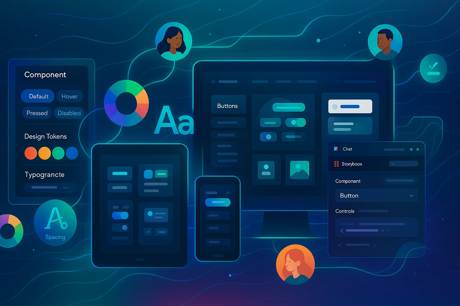
Core Components of Enterprise Design Systems
1. Design Tokens: The Universal Language
Design tokens are the atomic elements that define your visual language - colors, typography, spacing, and more. They serve as the single source of truth across all platforms and tools.
JSON{ "color": { "brand": { "primary": { "50": "#eff6ff", "500": "#3b82f6", "900": "#1e3a8a" } }, "semantic": { "success": "#10b981", "warning": "#f59e0b", "error": "#ef4444" } }, "typography": { "scale": { "xs": "0.75rem", "sm": "0.875rem", "base": "1rem", "lg": "1.125rem", "xl": "1.25rem" } }, "spacing": { "xs": "0.25rem", "sm": "0.5rem", "md": "1rem", "lg": "1.5rem", "xl": "3rem" } }
2. Component Library: Building Blocks for Experiences
Components should be atomic, flexible, and composable. Enterprise systems require additional considerations:
React TSX// Example: Enterprise Button Component interface ButtonProps { variant: 'primary' | 'secondary' | 'destructive' | 'ghost' size: 'sm' | 'md' | 'lg' loading?: boolean disabled?: boolean permissions?: string[] // Enterprise-specific trackingId?: string // Analytics integration children: React.ReactNode onClick?: () => void } export const Button: React.FC<ButtonProps> = ({ variant = 'primary', size = 'md', loading = false, disabled = false, permissions = [], trackingId, children, onClick, ...props }) => { // Permission checking logic for enterprise apps const hasPermission = usePermissions(permissions) if (!hasPermission) { return null // Or disabled state } return ( <button className={cn( buttonVariants({ variant, size }), loading && 'opacity-50 cursor-not-allowed' )} disabled={disabled || loading} onClick={() => { // Analytics tracking if (trackingId) { analytics.track('button_click', { id: trackingId }) } onClick?.() }} {...props} > {loading ? <Spinner size="sm" /> : children} </button> ) }
3. Documentation and Guidelines
Enterprise documentation must serve multiple audiences with varying technical expertise:
MARKDOWN## Button Component ### Usage Guidelines - Use primary buttons for main actions (max 1 per view) - Secondary buttons for supporting actions - Destructive buttons for irreversible actions ### Accessibility - Minimum 44px touch target - 3:1 contrast ratio for text - Focus indicators for keyboard navigation ### Enterprise Considerations - Permission-based rendering - Analytics integration - Loading states for async operations - Error handling patterns
Design Token Strategy for Enterprise Scale
Multi-Brand Architecture:
JSON{ "global": { "color": { "neutral": { /* shared neutrals */ } } }, "brand": { "corporate": { "color": { "primary": "#1d4ed8" } }, "subsidiary-a": { "color": { "primary": "#059669" } } }, "semantic": { "feedback": { "success": "{global.color.green.500}", "error": "{global.color.red.500}" } } }
Technology Stack and Toolchain
The Modern Enterprise Design System Stack
Design Tools:
- Figma: Primary design environment with enterprise features
- Design tokens: Style Dictionary for token transformation
- Prototyping: Figma's advanced prototyping for complex interactions
Development Tools:
- Storybook: Component documentation and testing
- React/Vue/Angular: Component implementation
- TypeScript: Type safety for large codebases
- CSS-in-JS or Tailwind: Styling architecture
Integration and Sync:
- Figma plugins: Bridge design and development
- Code Connect: Figma's new tool for production-ready code snippets
- Design token pipelines: Automated sync between design and code
Figma + Storybook Integration Workflow
1. Design Phase in Figma:
TypeScript// Figma Component with Variables const ButtonComponent = { variants: { variant: ['primary', 'secondary', 'destructive'], size: ['sm', 'md', 'lg'], state: ['default', 'hover', 'pressed', 'disabled'] }, properties: { text: 'Button text', icon: 'optional', loading: 'boolean' } }
2. Code Implementation in Storybook:
React TSX// Button.stories.tsx export default { title: 'Components/Button', component: Button, parameters: { docs: { description: { component: 'Primary button component for enterprise applications' } } } } as Meta<typeof Button> export const Default: Story = { args: { children: 'Primary Button', variant: 'primary' } } export const AllVariants: Story = { render: () => ( <div className="flex gap-4"> <Button variant="primary">Primary</Button> <Button variant="secondary">Secondary</Button> <Button variant="destructive">Destructive</Button> <Button variant="ghost">Ghost</Button> </div> ) }
3. Bidirectional Sync:
Using tools like story.to.design to automatically generate Figma components from Storybook, ensuring design and code remain in sync.
Code Connect: Bridging Design and Development
Figma's Code Connect (beta for Enterprise) brings production-ready code directly into Figma:
React TSX// Button.figma.tsx - Code Connect file import { figma } from '@figma/code-connect' import { Button } from './Button' figma.connect(Button, "component-id-from-figma", { props: { variant: figma.enum('Variant', { Primary: 'primary', Secondary: 'secondary', Destructive: 'destructive' }), children: figma.string('Text'), loading: figma.boolean('Loading') }, example: (props) => ( <Button variant={props.variant} loading={props.loading} > {props.children} </Button> ) })
Governance Framework: Managing Design at Scale
Design System Governance Models
1. Centralized Model
- Single team owns the entire system
- Ensures consistency but may slow innovation
- Best for: Highly regulated industries, strict brand requirements
2. Federated Model
- Core team sets standards, product teams contribute
- Balances consistency with agility
- Best for: Large enterprises with diverse product lines
3. Distributed Model
- Each product team manages their components
- Maximum agility but risk of fragmentation
- Best for: Startup-like environments within enterprises
Enterprise Governance Best Practices
Contribution Process:
Rendering diagram...
Quality Gates:
- Design Review: Accessibility, brand compliance, user research
- Technical Review: Performance, security, browser support
- Documentation: Usage guidelines, examples, migration paths
- Testing: Unit tests, visual regression, accessibility audits
Change Management:
TypeScript// Semantic versioning for design systems interface VersioningStrategy { major: 'Breaking changes (new design language)' minor: 'New components or significant updates' patch: 'Bug fixes and small improvements' } // Migration guidance interface MigrationGuide { version: string breakingChanges: string[] migrationSteps: string[] automatedMigration?: string // Codemod scripts timeline: string }
Design System Metrics and KPIs
Adoption Metrics:
- Component usage percentage across products
- Design token adoption rate
- Time to implement new features
- Developer satisfaction scores
Quality Metrics:
- Accessibility compliance rate
- Design-dev handoff time
- Number of design inconsistencies
- User experience impact measurements
Business Impact:
- Development velocity improvements
- Design debt reduction
- Cross-platform consistency scores
- Time to market improvements
Multi-Platform Strategy
Platform-Specific Considerations
Web Applications:
SCSS// CSS Custom Properties for theming :root { --color-primary: #{$color-brand-primary}; --color-surface: #{$color-neutral-white}; --spacing-md: #{$spacing-md}; } [data-theme="dark"] { --color-primary: #{$color-brand-primary-dark}; --color-surface: #{$color-neutral-900}; }
Mobile Applications:
SWIFT// iOS Design Tokens struct DesignTokens { struct Colors { static let primary = UIColor(hex: "#3b82f6") static let surface = UIColor.systemBackground } struct Spacing { static let xs: CGFloat = 4 static let sm: CGFloat = 8 static let md: CGFloat = 16 } }
Native Mobile Integration: Design systems must account for platform-specific patterns while maintaining brand consistency:
KOTLIN// Android Compose Implementation @Composable fun EnterpriseButton( text: String, variant: ButtonVariant = ButtonVariant.Primary, size: ButtonSize = ButtonSize.Medium, modifier: Modifier = Modifier, onClick: () -> Unit ) { Button( onClick = onClick, colors = ButtonDefaults.buttonColors( backgroundColor = when (variant) { ButtonVariant.Primary -> DesignTokens.Colors.primary ButtonVariant.Secondary -> DesignTokens.Colors.surface } ), modifier = modifier ) { Text( text = text, style = when (size) { ButtonSize.Small -> DesignTokens.Typography.bodySmall ButtonSize.Medium -> DesignTokens.Typography.bodyMedium ButtonSize.Large -> DesignTokens.Typography.bodyLarge } ) } }
Advanced Enterprise Features
Accessibility-First Design
Enterprise design systems must meet WCAG 2.1 AA standards as a baseline:
React TSX// Accessible component example export const FormField: React.FC<FormFieldProps> = ({ label, error, required, children, helpText, ...props }) => { const fieldId = useId() const errorId = useId() const helpTextId = useId() return ( <div className="form-field"> <label htmlFor={fieldId} className={cn('form-label', required && 'required')} > {label} {required && ( <span aria-label="required" className="text-error"> * </span> )} </label> {helpText && ( <div id={helpTextId} className="form-help-text"> {helpText} </div> )} {React.cloneElement(children, { id: fieldId, 'aria-describedby': cn( error && errorId, helpText && helpTextId ), 'aria-invalid': !!error })} {error && ( <div id={errorId} role="alert" className="form-error" > {error} </div> )} </div> ) }
Security and Compliance Integration
Enterprise components must handle sensitive data appropriately:
React TSX// Data classification and security interface DataClassification { level: 'public' | 'internal' | 'confidential' | 'restricted' retention?: string encryption?: boolean } interface SecureInputProps extends InputProps { dataClassification: DataClassification auditLog?: boolean masking?: 'partial' | 'full' | 'none' } export const SecureInput: React.FC<SecureInputProps> = ({ dataClassification, auditLog = false, masking = 'none', ...props }) => { // Implement security measures based on data classification const handleChange = (value: string) => { if (auditLog) { securityLogger.log({ action: 'data_input', classification: dataClassification.level, timestamp: new Date().toISOString() }) } props.onChange?.(value) } return ( <Input {...props} onChange={handleChange} type={masking === 'full' ? 'password' : 'text'} autoComplete={dataClassification.level === 'restricted' ? 'off' : undefined} /> ) }
Internationalization and Localization
Enterprise systems often serve global audiences:
React TSX// i18n-ready component design export const DatePicker: React.FC<DatePickerProps> = ({ locale = 'en-US', format, timezone, ...props }) => { const formatDate = useCallback((date: Date) => { return new Intl.DateTimeFormat(locale, { dateStyle: format || 'medium', timeZone: timezone }).format(date) }, [locale, format, timezone]) return ( <div className="date-picker" dir={getTextDirection(locale)}> {/* Date picker implementation */} </div> ) }
Implementation Roadmap
Foundation Milestone
Prerequisites:
- Executive sponsorship secured
- Core team assembled
- Initial user research completed
Objectives:
- Establish design token architecture
- Create core component library (buttons, inputs, typography)
- Set up toolchain (Figma + Storybook)
- Define governance processes
Deliverables:
- Design token specification
- 15-20 foundational components
- Documentation site
- Contribution guidelines
Success Criteria:
- 80% of new features use design system components
- 50% reduction in design-to-development handoff time
- Core team trained and productive
- First pilot project successfully implemented
Expansion Milestone
Prerequisites:
- Foundation milestone success criteria met
- Stakeholder feedback incorporated
- Pilot project learnings applied
Objectives:
- Expand component library to cover 80% of use cases
- Implement complex patterns (data tables, forms, navigation)
- Establish multi-platform support
- Train teams and drive adoption
Deliverables:
- 50+ components and patterns
- Mobile design system adaptation
- Training materials and workshops
- Migration tools and scripts
Success Criteria:
- 90% component coverage across products
- 30% faster development velocity
- 95% accessibility compliance
- 3+ product teams actively contributing
Optimization Milestone
Prerequisites:
- Widespread adoption achieved
- Performance baseline established
- Analytics infrastructure in place
Objectives:
- Optimize performance and bundle sizes
- Advanced theming and customization
- Analytics and usage tracking
- Continuous improvement processes
Deliverables:
- Performance optimization guidelines
- Advanced theming system
- Usage analytics dashboard
- Automated testing and quality gates
Success Criteria:
- Sub-second component load times
- 99% uptime for design system services
- 85% developer satisfaction scores
- Self-sustaining contribution ecosystem
Common Challenges and Solutions
Challenge 1: Stakeholder Buy-in
Problem: Executives see design systems as cost centers rather than strategic investments.
Solution:
- Present ROI calculations with specific metrics
- Start with pilot projects that show immediate value
- Connect design consistency to brand value and user satisfaction
Business Case Template:
Current State:
- 40 hours/week spent on repetitive design tasks
- 3-day average design-to-development handoff
- 15% of development time spent on design inconsistencies

Future State with Design System:
- 20 hours/week design time (50% reduction)
- 1-day design-to-development handoff
- 5% development time on inconsistencies

Annual Savings: $2.4M in labor costs
Time to Market: 22% faster
Quality Improvements: 95% accessibility compliance
Challenge 2: Legacy System Integration
Problem: Existing applications use outdated technologies that don't support modern design systems.
Solution:
- Create CSS-only versions of components for legacy systems
- Develop progressive enhancement strategies
- Plan modernization roadmap with business priorities
CSS/* Legacy-compatible CSS components */ .ds-button { /* Base styles that work in older browsers */ display: inline-block; padding: 12px 24px; background: #3b82f6; color: white; text-decoration: none; border-radius: 6px; border: none; cursor: pointer; } .ds-button:hover { background: #2563eb; } /* Progressive enhancement for modern browsers */ @supports (display: flex) { .ds-button { display: inline-flex; align-items: center; gap: 8px; } }
Challenge 3: Cross-Team Coordination
Problem: Multiple teams working on the design system create conflicts and inconsistencies.
Solution:
- Establish clear ownership and contribution processes
- Use RFC (Request for Comments) processes for major changes
- Implement automated testing and quality gates
RFC Process Example:
MARKDOWN# RFC: Navigation Component Enhancement ## Summary Add breadcrumb navigation support to the main navigation component. ## Motivation 5 product teams have built custom breadcrumb solutions, creating inconsistency. ## Detailed Design [Technical specifications] ## Alternatives Considered [Other approaches evaluated] ## Implementation Plan [Timeline and rollout strategy]
Challenge 4: Performance at Scale
Problem: Large design systems can impact application performance.
Solution:
- Implement tree-shaking and code splitting
- Use dynamic imports for complex components
- Monitor and optimize bundle sizes
React TSX// Dynamic component loading const HeavyDataTable = lazy(() => import('./DataTable').then(module => ({ default: module.DataTable })) ) export const DataTableContainer: React.FC = (props) => { return ( <Suspense fallback={<TableSkeleton />}> <HeavyDataTable {...props} /> </Suspense> ) }
Future-Proofing Your Design System
Emerging Trends for 2025 and Beyond
AI-Powered Design Systems:
- Automated component generation from designs
- Intelligent design recommendations
- Predictive accessibility analysis
Advanced Design Tokens:
- Contextual tokens that adapt to user preferences
- AI-driven color palette optimization
- Dynamic typography scaling
Component Intelligence:
React TSX// Future: AI-enhanced components export const SmartButton: React.FC<SmartButtonProps> = ({ intent, // AI determines optimal styling context, // Understands placement context userPreferences, // Adapts to accessibility needs ...props }) => { const optimizedProps = useAIOptimization({ intent, context, userPreferences, analytics: useComponentAnalytics() }) return <Button {...optimizedProps} {...props} /> }
Design System Evolution Strategy
Continuous Improvement Framework:
- Usage Analytics: Track component usage patterns
- Performance Monitoring: Measure impact on application performance
- User Feedback: Gather insights from designers and developers
- Competitive Analysis: Stay current with industry best practices
- Technology Updates: Evolve with platform and framework changes
Version Management:
JSON{ "roadmap": { "milestone-1": "Enhanced accessibility features", "milestone-2": "AI-powered design recommendations", "milestone-3": "Advanced theming capabilities", "milestone-4": "Cross-platform component parity" }, "deprecation": { "v2.x": "Legacy support until next major release", "v3.x": "Current stable version", "v4.x": "Beta with new architecture" } }
Measuring Success: KPIs and Analytics
Design System Health Metrics
Adoption Metrics:
- Component usage coverage percentage
- Design token adoption across platforms
- Number of custom implementations vs. system components
Quality Metrics:
- Accessibility compliance rate (target: 100% WCAG 2.1 AA)
- Cross-browser compatibility scores
- Performance impact measurements
Efficiency Metrics:
- Design-to-development handoff time
- Time to implement new features
- Code reusability percentage
Business Impact Metrics:
- Development velocity improvement
- Design consistency scores
- User satisfaction ratings
- Brand recognition improvements
Analytics Implementation
Usage Tracking:
React TSX// Component usage analytics export const useComponentAnalytics = (componentName: string) => { useEffect(() => { analytics.track('component_render', { component: componentName, version: packageVersion, timestamp: Date.now(), route: window.location.pathname }) }, [componentName]) } // Usage in components export const Button: React.FC<ButtonProps> = (props) => { useComponentAnalytics('Button') // Component implementation }
Design System Dashboard: Create a comprehensive dashboard that tracks:
- Component adoption rates
- Performance metrics
- User feedback scores
- Breaking change impact
- Migration progress
Case Studies: Enterprise Success Stories
Case Study 1: IBM Carbon Design System⁸
Challenge: IBM needed to create consistent experiences across 17 business units and 170+ products.
Solution: Open-source Carbon Design System with modular architecture.
Results:
- 40% faster development for new features
- 90% reduction in design debt
- Unified experience across all IBM products
- Active community with 1,000+ contributors
Key Learnings:
- Open-source approach drives adoption and contribution
- Strong governance prevents fragmentation
- Community engagement is crucial for long-term success
Case Study 2: Salesforce Lightning Design System⁹
Challenge: Salesforce's rapid growth led to inconsistent user experiences across the platform.
Solution: Comprehensive design system with focus on accessibility and customization.
Results:
- 50% reduction in development time for new features
- 99% accessibility compliance across products
- Seamless white-labeling for enterprise customers
- Improved user satisfaction scores
Key Learnings:
- Accessibility-first approach pays dividends
- Customization capabilities are essential for enterprise adoption
- Regular user research drives system evolution
Case Study 3: Atlassian Design System¹⁰
Challenge: Multiple product teams were building similar components with different implementations.
Solution: Federated design system with strong governance and contribution processes.
Results:
- 60% faster feature development
- 85% component reuse across products
- Improved cross-product user experience
- Reduced technical debt
Key Learnings:
- Federated approach balances consistency with team autonomy
- Clear contribution processes enable scaling
- Regular governance reviews maintain quality
Tools and Resources for 2025
Essential Design System Tools
Design Tools:
- Figma (primary): Advanced component systems, variables, auto-layout
- Adobe XD: Alternative with strong prototyping capabilities
- Sketch: Still relevant for teams heavily invested in the ecosystem
Development Tools:
- Storybook: Industry standard for component documentation
- Chromatic: Visual testing and review platform
- Bit: Component sharing and collaboration platform
Token Management:
- Style Dictionary: Amazon's token transformation tool
- Theo: Salesforce's token management system
- Design Tokens Community Group: Standards and specifications
Testing and Quality:
- Axe-core: Accessibility testing automation
- Percy: Visual regression testing
- Lighthouse CI: Performance monitoring
- Jest/Vitest: Unit testing frameworks
Build Your Team
Core Team Roles:
- Design System Lead: Strategy and vision
- Design Lead: Visual design and UX patterns
- Engineering Lead: Technical architecture and implementation
- Product Manager: Roadmap and stakeholder management
- Documentation Specialist: User experience for the system itself
Extended Team:
- Accessibility Expert: Ensure universal usability
- Performance Engineer: Optimize for speed and efficiency
- DevOps Engineer: Tooling and automation
- Community Manager: Drive adoption and gather feedback
Conclusion: The Future of Enterprise Design
Enterprise design systems in 2025 represent far more than collections of reusable components - they're strategic platforms that enable organizational transformation. The most successful systems combine technical excellence with human-centered governance, creating foundations that scale with business growth while maintaining the flexibility to adapt to changing needs.
Key Success Factors:
Start with Strategy: Align design system goals with business objectives from day one. The most effective systems solve real business problems, not just design problems.
Invest in Governance: Technology alone doesn't guarantee success. Strong governance processes, clear contribution guidelines, and active community management are essential for long-term sustainability.
Measure Impact: Use data to demonstrate value and guide evolution. Track both operational metrics (adoption rates, development velocity) and business outcomes (user satisfaction, revenue impact).
Plan for Scale: Build systems that grow with your organization. Consider future needs, plan for platform expansion, and design governance processes that work at scale.
Foster Community: The best design systems are built by communities, not committees. Create environments where designers and developers can contribute, learn, and collaborate effectively.
As we look toward the future, design systems will continue to evolve, incorporating AI-powered optimization, advanced accessibility features, and seamless cross-platform experiences. Organizations that invest in building robust, scalable design systems today will be best positioned to adapt to tomorrow's challenges while delivering exceptional user experiences that drive business success.
The question isn't whether your organization needs a design system - it's whether you'll build one strategically or let inconsistency and inefficiency build one for you. The choice, and the competitive advantage that comes with it, is yours.
References
¹ SoftKraft. (2024). "Enterprise Design Systems - 7 Proven Best Practices in 2024." Retrieved from softkraft.co/enterprise-design-systems/
² Superside. (2024). "Benefits of Design Systems for Brands in 2025." Retrieved from superside.com/blog/design-systems
³ Superside. (2024). "Benefits of Design Systems for Brands in 2025." Retrieved from superside.com/blog/design-systems
⁴ Klüver, M. (2019). "Design System ROI Study." Internal research report.
⁵ Sparkbox. (2019). "Design Systems Survey Results." Retrieved from sparkbox.com
⁶ Goldenflitch. (2024). "Challenges and Importance of Enterprise UX Design." Retrieved from goldenflitch.com/blog/challenges-and-importance-of-enterprise-ux-design
⁷ Forrester Research. (2020). "Enterprise Software Project Success Rates." Retrieved from forrester.com
⁸ IBM Design. (2024). "Carbon Design System." Retrieved from carbondesignsystem.com
⁹ Salesforce UX. (2024). "Lightning Design System Documentation." Retrieved from lightningdesignsystem.com
¹⁰ Atlassian Design. (2024). "Atlassian Design System." Retrieved from atlassian.design
¹¹ Slack Design. (2019). "Design System Impact Study." Internal metrics report.
¹² Ray, A. (2018). "Design Systems Efficiency Research." UX Research publication.
¹³ Klüver, M. (2019). "Design System Development Team Efficiency." Follow-up research report.
Related Posts

The ROI of Headless Architecture: Real Numbers from 50+ Enterprise Migrations
After analyzing 50+ enterprise headless migrations, the average ROI is 312% over 3 years. But 43% fail to meet expectations. Here's the data-driven truth about headless architecture ROI.

Drupal 11 vs WordPress vs Strapi vs Payload: The 2025 Enterprise CMS Showdown
Compare Drupal 11, WordPress, Strapi, and Payload CMS for enterprise use. Real TCO analysis, performance benchmarks, and decision framework to choose the right open-source CMS.

Drupal 7 Migration in 2025: The Executive Playbook
Drupal 7 reached end-of-life on Jan 5, 2025. Here’s a practical playbook to reduce risk, protect revenue, and ship a clean migration on time.